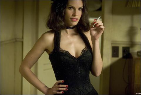
“You’ll never shoot me. Don’t forget who I look like. Because that girl…that sad, dead bitch…she’s all you have.” — Madeleine Linscott
While known for a signature, deft style—one of recurring Hitchcockian themes, doppelgangers, femmes fatales, explosions of operatic violence and sweeping and stalking cameras—the director is the first to laughingly admit that he doesn’t consciously ask, “How can I make this more Brian De Palma?” when he starts a picture. “That’s an unconscious thing. I don’t know why you’re attracted to certain material,” he notes. “There’s just something that hooks you in and intrigues you.”
Still, there are themes to which he finds himself repeatedly drawn. For example, he has long explored the common threads of doubles—both internal and external—those with fractured personalities who transfer guilt onto other characters. It is not uncommon for De Palma’s characters to assume complexities and personalities of others. From Body Double to Dressed to Kill and Raising Cain, he has often explored that territory. De Palma did find it an interesting fit that many of his recurring themes were echoed in the rapid-fire words and lurid specificity of Ellroy’s world. For example, Madeleine becomes fixated on knowing (and sleeping with) a girl who looks like her, and she falls into the sway and swagger of Betty, beginning to assume her characteristics to seduce others. She even uses Bucky’s obsession with the case to get him to return to her bed.
But, as in all adaptations, there would be major cuts to the source material. During the first reveal of the Dahlia’s crime scene, De Palma focuses the audience on an event (Lee’s shoot-out with Baxter Fitch) that happens simultaneous to the body’s discovery—very much the antithesis of what happens in the Ellroy book. De Palma thought it would be ironic if the big crime was actually behind the smaller one. “I wanted to completely throw the Dahlia’s reveal away in the background of all those other things going on,” he states. “We had to compress a number of story lines, and we got it down to four herrings. Because most of the story is told through indirection, you think, ‘This is the important thing.’ But in reality, we moved a few of them off the playing field.”
While it was important to the screenwriter and director to bring both Ellroy’s words and intricate subplots into the film version of The Black Dahlia, they knew that the visual medium of film would require some tricks that weren’t available to the novelist. For example, Ellroy poses that Betty’s killer was inspired to carve a grotesque smile onto her face by the story of Victor Hugo’s tragic character Gwynplaine.
In Hugo’s 1869 novel “L’Homme qui Rit,” he writes of a man who has a permanent grin carved upon his face by the king, in revenge for the treachery of Gwynplaine’s father. This haunting character has inspired many a film interpretation since the early 1900s (as well as serving as inspiration for Batman cartoonist Bob Kane’s evil antagonist The Joker).
The director notes, “In Ellroy’s book, the image of ‘The Man Who Laughs’ is very much on the murderer’s mind…and the Dahlia is scarred in precisely that manner.”
He next asked his team, “What’s the best way to show it? Was there a movie? Sure enough…there was.” De Palma found that showing Bucky, Lee and Kay watching German director Paul Leni’s 1928 film The Man Who Laughs would tie together his loose ends nicely. (Coincidentally, the film was distributed by Universal Pictures and became one of the studio’s first transitional talkies, incorporating sound with cards for the first time).
Few American directors have opted to use the palette of colors and complex camera movements for which De Palma is known. Up until the fight scene between his two supercops, De Palma uses saturation coloring. Then, he moves on to very strong contrasting colors to tell the bulk of his story, complete with desaturated flashbacks. The director notes, “The whole movie is basically a descent into hell. With noir, you try to use high contrast, a lot of shadows and low angles.”
De Palma chose to work with a team—including longtime collaborators, former opera set and Fellini designer Dante Ferretti and renowned cinematographer Vilmos Zsigmond—to design specific sequences in service of the story. The director relates, “I look at a scene, and then I figure out what’s the best position for the camera for a particular piece of action. Then, I maximize the visuals and design the locations for sequences.” Notably, De Palma is known to create three-dimensional models to understand exactly what he wants to film before he starts rolling camera.
Of his directing style, he shares, “It’s not interesting to me unless it speaks to me visually,” he says. “Most directing is quite simple. If you have good taste and know how to direct actors, then you’ll shoot either a medium shot or medium close-up quite well. Unfortunately, most people have been brought up on TV, and many directors offer dialogue with two- and three- and steadicam shots.”
Next Page: Visuals and Dialogues
Views: 67


