The baseball movie has nearly as long and vaunted a history as the sport itself, but Bennett Miller wanted Moneyball to have a visual style to match its bold, contemporary subject and themes. The look of the film was deigned to reflect not only the vivid thrill of ballgames but also the more shadowy territory of finding new paths to success – territory rife with darker shadings of anxiety, conflict, obsession, regret and aspiration that overlay the shinier side of the sport.
To do so, Miller collaborated with a team that includes director of photography Wally Pfister, ASC, best known for his six films with director Christopher Nolan and an Oscar® winner for his work on Inception; and with Oscar®-nominated production designer Jess Gonchor and costume designer Kasia Walicka Maimone – both of whom worked with Miller on Capote.
For the photography, Miller tilted towards an unsparing, honest naturalism. “Bennett has a precise, deliberate style that doesn’t tell you the story so much as observes it” notes Michael De Luca. “Bennett treats Billy and Peter’s dilemma in a forensic way – putting together the pieces of the team to get to a winning season – just as Capote was a forensic study of a mystery and piecing together clues to get to an answer.”
Wally Pfister looked for his own stylistic clues in the 1970s work of Gordon Willis – the cinematographer’s cinematographer whose remarkable resume encompasses such films as The Godfather, The Godfather Part II, The Parallax View and All the President’s Men. Willis’ shaded, rough-hewn, multi-layered imagery, imagery that seemed to subtly express the murky, modern search for meaning in its fabric, became a constant inspiration to the production.
“Gordon Willis is my all-time cinematic hero, my favorite DP, so it’s funny that a lot of the films Bennett referenced were shot by him,” notes Pfister. Pfister and Miller also looked at other films from that era, particularly Milos Forman’s One Flew Over The Cuckoo’s Next, shot by Haskell Wexler. “Those gritty 70s pictures not only had the look photographically we were interested in, but the design and pacing,” says Pfister.
“Wally’s background is in documentary,” Miller explains. “He started by shooting news footage – that was his father’s world. He is great at working with natural environments and natural light; philosophically, he likes to enter a situation and join it, rather than reinvent it. He gave the film a flexibility that allowed us to work with a non-fiction approach when needed.”
In keeping with the eclipsed, contrasting lighting of that era, Pfister lit several of the film’s key locations –– the A’s clubhouse, the offices and the parking garage where Billy and Peter have their first real conversation – with harsh fluorescent lighting. “This seemed to work not just for the photography, but for the story as well,” Pfister says.
Pfister also brought a distinctive, subtly expressionistic sensibility to the baseball action. “If you look out at one of these stadiums during a night game, generally all the lights in the stadium are turned on to create a very even light for the television cameras, the fans, and the home viewing audience. I wanted there to be a little more mood to it, so I shut off half of the stadium lights,” the cinematographer explains. “That created more of an edge light. I did it very judiciously and tried to find a formula where I could make it look a little darker, but still within the reality of what baseball looks like at night. I like using darkness as a tool for the drama and for the mood.”
Early on, the decision was made to shoot on 35mm film. “I really felt that this movie needed to be shot on film rather than video, because film has the soul and the depth to tell this story the way Bennett wanted to tell it,” Pfister summarizes.
For production designer Jess Gonchor, who most recently garnered an Oscar® nomination designing a 19th Century Arkansas for the Coen Brothers’ True Grit, the creative task was similar: to find the lines where authenticity and drama converge. “This is a real story, it really happened, it’s a piece of history,” Gonchor observes, “so maintaining the integrity of who the A’s are and what their payroll is and the conditions of their facilities were key to the design. But there were also ways that we could give it a style, a dramatic vision.”
The director agrees. “It’s hard to appreciate the artistry of Jess’s task,” says Miller. “This isn’t a fantasy film, where he might have had unconstrained license to go off and invent. Instead, he had to perform a kind of haiku design – one that served the veracity of the story and gave credibility to the world it’s set in, but at the same time, to communicate the tone and atmosphere that serves the story. It’s a thankless task, but critical – you either trust the film or you don’t.”
To achieve the authenticity part of the equation, Gonchor went to the source. “Having Major League Baseball and the A’s on board was huge,” Gonchor says, noting the copious vintage footage and photos they put at his disposal. “We were also able to spend a lot of time at the Coliseum, on the field, inside the locker room, inside the weight room, inside Art’s office. They were very open to us.” Committed to providing as realistic a representation of the sport as viewers will ever have seen in a motion picture, MLB worked closely with Gonchor and the art department to ensure authenticity of every aspect, from accurate depictions of clubhouses and ballpark offices down to the use of the correct batting gloves.
The anchor of the design was the A’s clubhouse, the interior of which Gonchor and his art department built from the ground up on a soundstage because the real thing had gone through too many changes in the intervening decade. Their work brought the structure’s claustrophobic “submarine” feeling to the fore. “You go from the openness of the playing field into this subterranean, worn-in concrete world,” Gonchor describes. “We echoed that mood throughout the set.”
Beane was taken aback by the re-creation of his old digs. “It was amazing. They littered the background with so many little details, like the picture of Joe Strummer from the Clash that you see in my office. You think they’re just visiting with you for 15 minutes, but you don’t realize they’re writing down every little single thing. We’re not a very formal bunch and we kind of fly by the seat of the pants and they did a great job capturing that environment that existed here and still does.”
Gonchor and set decorator Nancy Haigh took an unusual approach to the clubhouse’s locker room, which is the players’ inner sanctum. Rather than create a static set, they allowed the room to evolve, becoming more and more worn-in over the course of 6 weeks of soundstage work. They encouraged the cast to use and abuse it as real players would, sweating in the weight room, hanging out as buddies in off-hours, even moving things around at their leisure. “The idea was that after several days or weeks, it would feel like a real place,” Gonchor explains.
The offices within were each imbued with distinct personalities. “All the sets draw upon who the characters are as people,” Gonchor comments. “Billy is always pacing and in motion, so his office is disheveled and shaken up. Peter is a computer guy, so everything is super neat and tidy. And Art Howe is like a field general, the captain of the ship, so his office is more militant and orderly.”
Deep in the bowels of the clubhouse is one of Gonchor’s favorite sets: the Scouting Room — a spare, dungeon-like, underground cinder block adorned with stark white boards listing all the players up for grabs – which serves as the “War Room” for Beane and Brand. “It has a kind of old industrial feeling,” notes Gonchor. “It’s almost like an interrogation room. I think it drives home the fact that this team had a very small payroll and they had to make something happen in a new way. So into this old bunker comes this kid using computers and it becomes about mixing up those styles.”
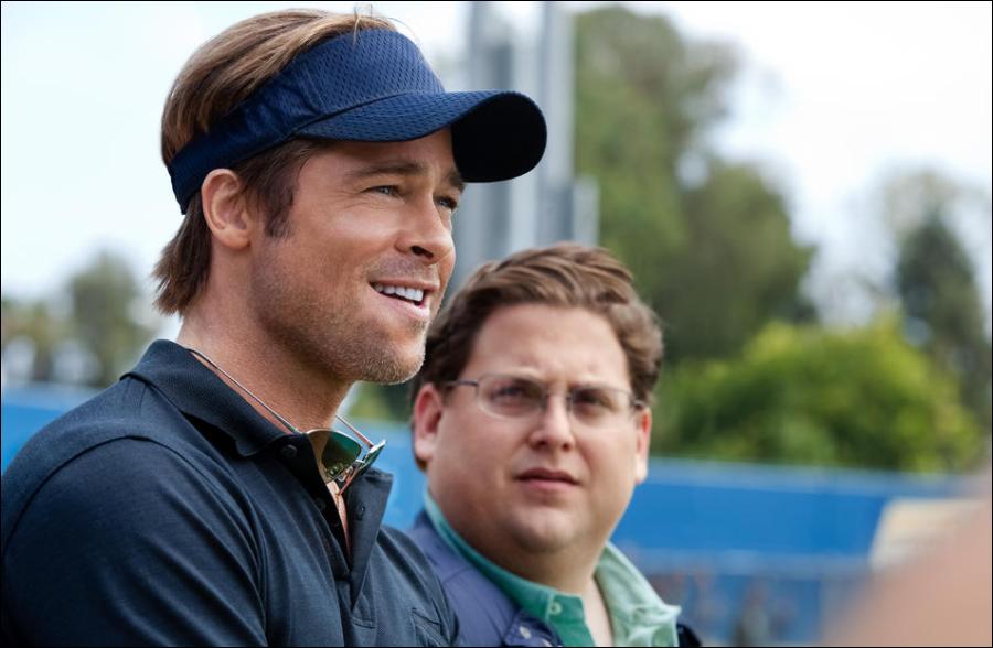
A similar mix of styles comes to the fore in the work of Kasia Walicka Maimone, who previously designed the costumes for Capote as well as many of Miller’s commercials and music videos. For the A’s uniforms, she recruited veteran sports costumer Edward T. Hanley, who worked very closely with Robin Jaffe of Major League Baseball to ensure that each actor wore his authentic uniform exactly as the player he is portraying did. Hanley, who was formerly in the sports uniform business and whose credits include Little Big League, Any Given Sunday, Rudy, and Jerry Maguire oversaw all the uniforms in the film, from obscure minor league teams to the New York Yankees and Kansas City Royals. “Ed has a great relationship with Major League Baseball,” Maimone notes. “He’s very knowledgeable about all the regulations of Major League Baseball, which are very much reflected in the movie.”
But for the main characters in the film, Maimone had a more open palette. When it came to Billy Beane, she wanted to create “an iconic look of a hero who breaks the rules of the establishment.” Maimone says she was inspired not only by the real Billy Beane, but by voluminous research into styles created by leading figures throughout the 20th century, ranging from legendary baseball general managers to scientific innovators such as Albert Einstein. “There is a certain look of people who function as icons in society, and we needed to soak our character in that, ” she says. “We had a wealth of information available about the real Billy Beane but I don’t think anybody was interested in an exact portrayal. The reality gave us a place from which to jump off.”
Her image of Beane was that of a gritty cultural provocateur. Maimone says, “I felt Billy had to live within the sports world as a very manly character, unstudied in any fashion sense. The goal was to create a look for a man who starts to take on the power of the icon myth, almost effortlessly.”
In contrasting Beane with his counterpart Peter Brand, Maimone honed in on a conservative look that derives from his Ivy League background. She explains, “For Peter, we researched clothing worn by students at Yale and the other Ivy Leagues. Unlike Billy, who is influenced by the baseball world, Peter’s look is very preppy, very Brooks Brothers.”
Maimone goes on: “Peter is basically guarded by his clothing. That’s why he’s always composed and put together. But, from time to time I feel like he wants to be Billy Beane, to be self-assured, confident, effortless, casual – and sometimes almost dangerous. Their differences, and the combination of them together, is what is so powerful.”
Miller says, “Kasia’s challenge on this movie was, in many ways, similar to Jess Gonchor’s on the production design. From the limited palette that the real people in this story present, she had to create costumes that were credible but also find a design that adds up to something greater than the sum of its parts – use the elements to communicate something that is beyond believable, but creates a mood.”
Related Link: Read the Full Production Notes for Moneyball
Visits: 241